An app that could change every week and still feel the same
Cake DeFi grew from a pre-Covid staking idea into an investment platform for digital-asset yield. Every new service had been added to a structure never meant to hold it.
New customers said they didn’t understand the app and could not find what they needed.
Where things stood
The fundamentals were never laid at the start, because at the start that is neither foreseeable nor affordable.
By the time I joined, the structure held far more than it was built for.
A new coin, a new earning type, sometimes a whole new business line, all the time.
Every one of them had been squeezed in somewhere.
The team could ship, but not restructure a platform for scale.
I was brought in for senior expertise in scale and modularity.
How it went
The full redesign was the only move, and the expected one. The real problem was different: an app that has to change fast and often, without going back to square one each time, while holding the rule that navigation and orientation must not keep moving on the people who use it.
What customers actually wanted
How much am I earning today? People logged in daily to check their balances, which drove subsequent actions like on any investment app. What differed was the complexity of the yield products and the speed at which new assets and earning types arrived.
The solution – Fewer patterns, and familiar ones
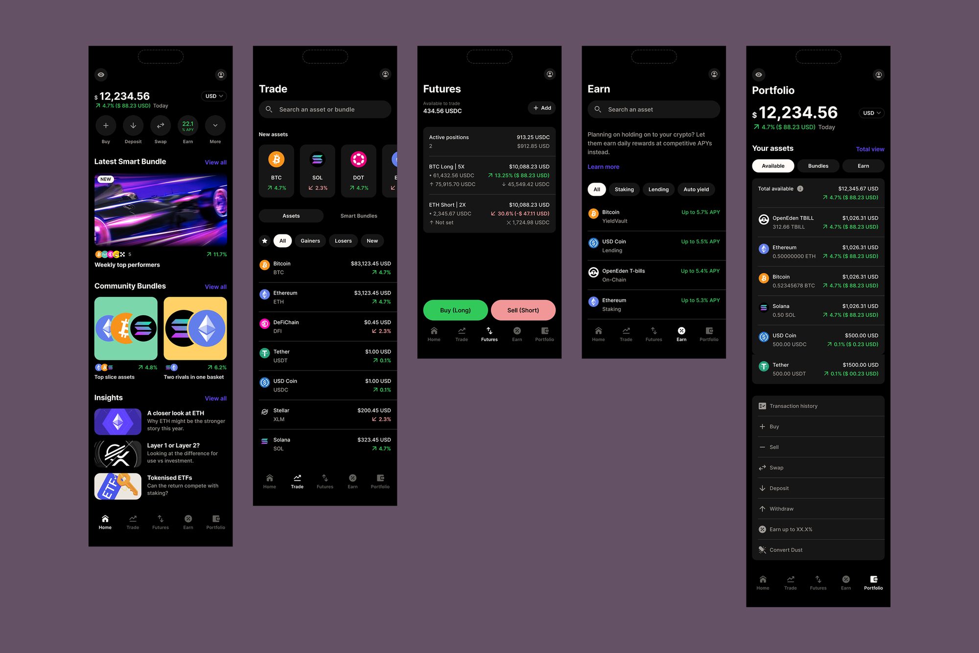
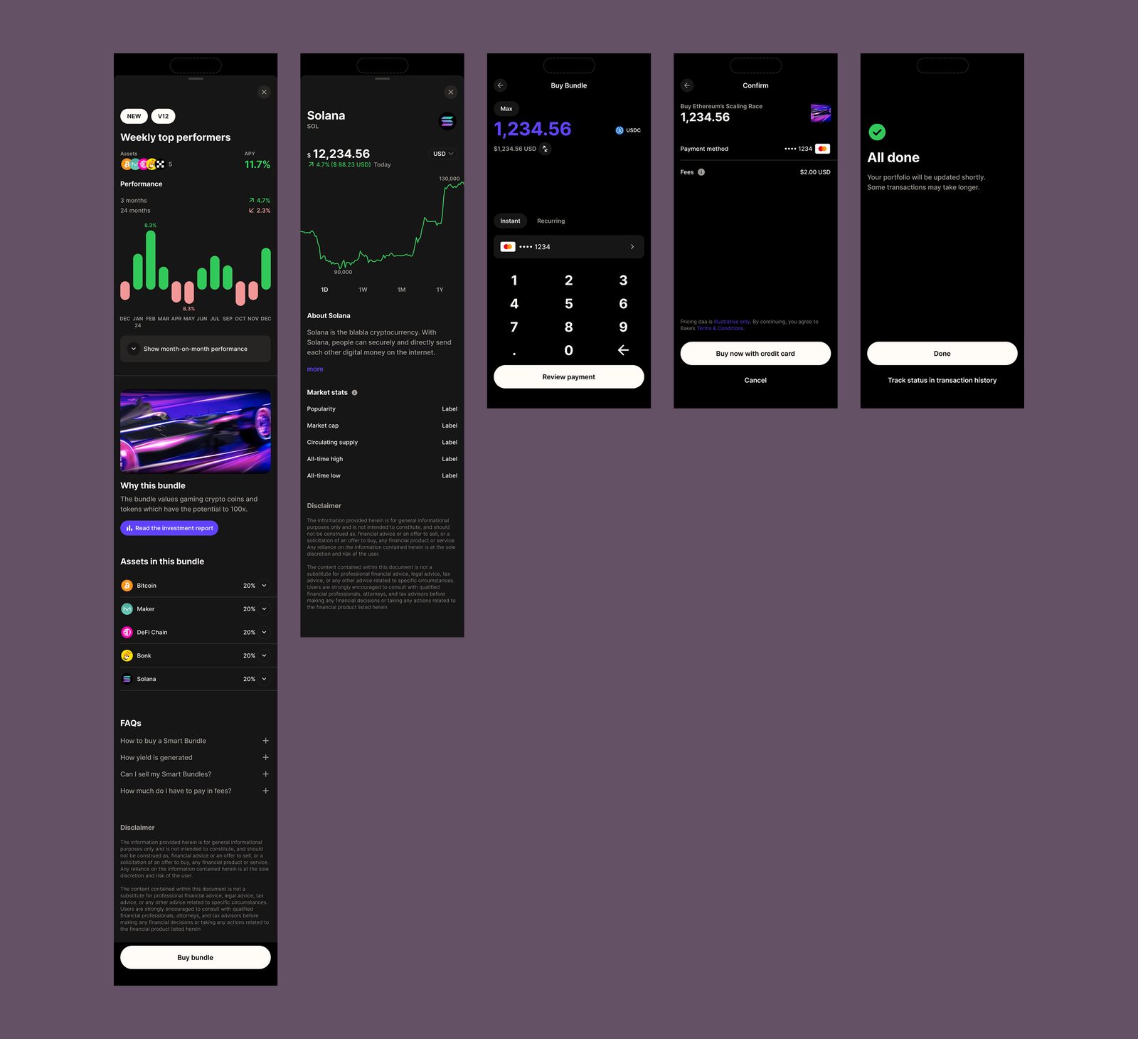
Strong adherence to a small set of patterns, and a constant effort to make the set smaller. Wherever possible the patterns were ones people already knew from iOS, Android or established apps, with simple terminology, so something that changed a lot still felt familiar.
A design system that did the work
The system used deep nesting: every component was controlled from the inspector, full built-in auto-layout and responsiveness, down to icons, images and spacing. A hi-fi page could be built from scratch in two minutes, which left the time for the journey itself. Engineering had the same components in code and converted screens quickly. Design became less UI and almost exclusively journey design.
The whole app open before the first deposit
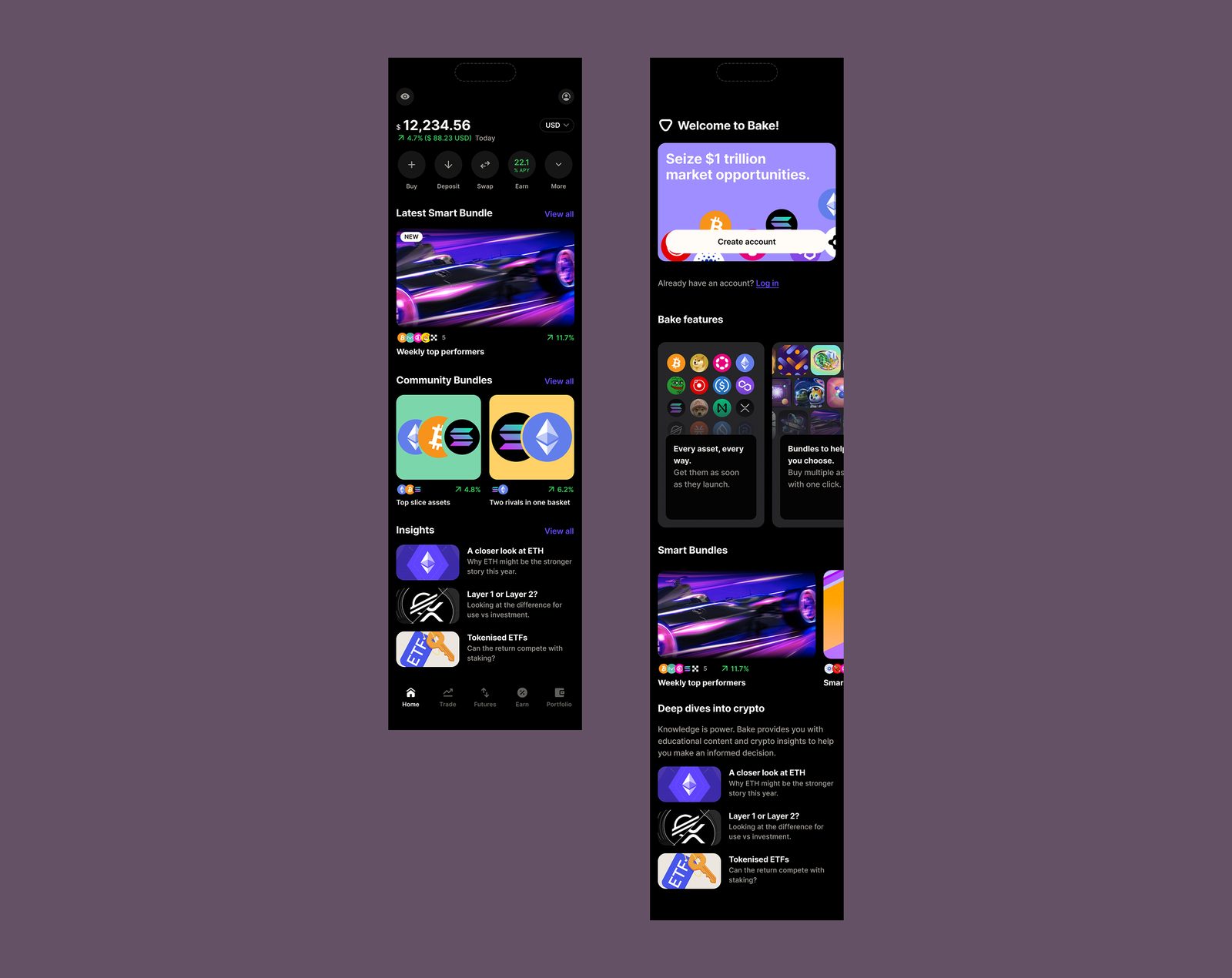
For a financial app, onboarding should lead to a first deposit, because that is the real buy-in. So the entire app was opened to people who wanted to explore before deciding. Every page knew it was showing a non-customer, so copy, empty states and asset views could prompt for a first deposit to start earning immediately.
What it did
Design and build got more than half faster, because the same components ran through design reviews, the design file and the code. More people browsed offers and converted, by about a third.
My role
I owned the user experience strategy of the mobile product across UX, the modular design system and its front-end counterpart. The team grew from four to twelve on site, with collaboration, production and quality processes and a customer-centric culture built alongside the product.